
To get a sense of what I'm talking about, here are our High temperatures for the last few months:

November started out really cold, and it ended really warm. December started really warm and ended really cold. January went cold-warm-cold-warm-cold. And February has mostly been pretty cold. Is this sort of variation normal? Can't we ever have nice, "average" temperatures?
This is a theme we've tackled a few times before in:
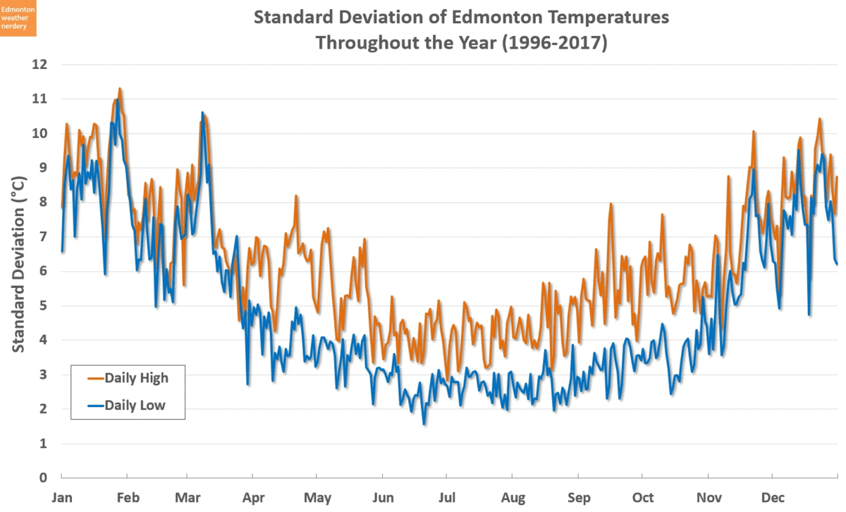
- How Normal is Average - during the summer about 80% of the days are within ±5°C of the average temperature, but in the winter that range doubles to ±10°C.
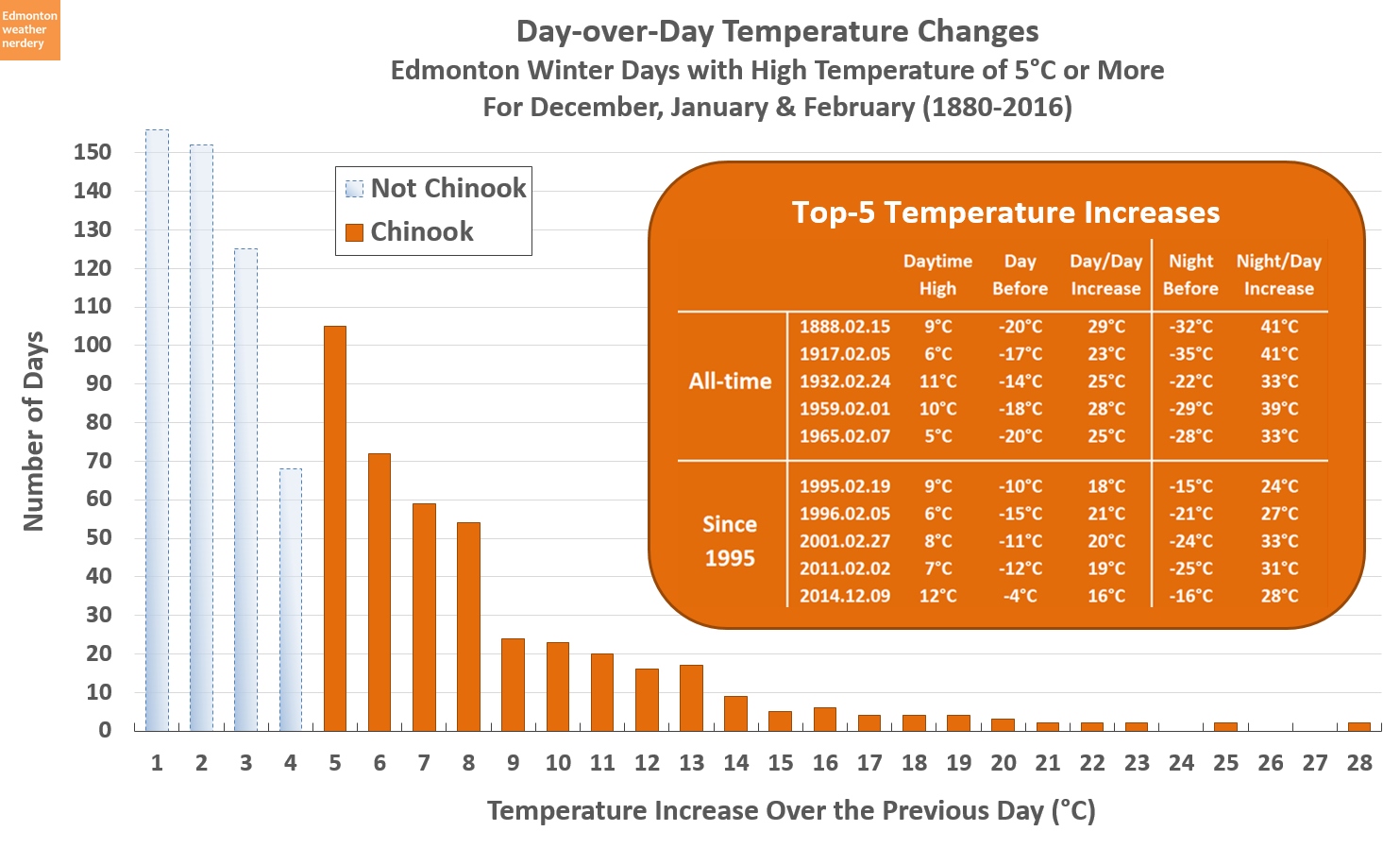
- Does Edmonton Get Chinooks - we don't necessarily get chinooks like Calgary does, but we do usually see an an echo of whatever they get.
- 'Tis the season of -20°C - even in the middle of winter we get a lot of warm days to balance off the cold ones.
2017

This is the chart we'll be working with, but it needs a bit of explanation.
This is a chart that we use all the time around here, and it shows daily High temperatures throughout the year. We're going to stick with High temperatures today because they are more variable than the Low temperatures. And so if it feels like our temperatures are behaving erratically then we'll see that more easily with the Highs.
The red and dark blue areas in the chart are the Highs for 2017, and they show whether each day was above or below the average for that time of year. The orange and lighter blue areas in the background show the temperature distribution that Edmonton has seen since 1996, with the warmest, second warmest, coldest and second coldest. The 25th and 75th percentiles are shown as a grey band.
Those 25th and 75th percentiles will be what we're focusing on today. I didn't want to look at just any ol' temperature swing, but wanted to specifically look at when we swing from being warmer than normal to colder than normal, or visa versa. The 25th and 75th percentiles work as handy cutoffs for that.
So with all of that said then: the yellow lines in this chart show every time that the temperature swung from cold (below the 25th percentile) to warm (above the 75th percentile) or the opposite. In 2017 that happened 38 times.
There's a formula controlling all this, and the lines might not exactly match what someone would eye-ball off of the chart, although they should be close. When the temperature spends lots of time hanging around the average that doesn't count as a swing, and if the temperature stays warm or cold for a long time then this chart tries to pick a consistent start or end point. Normally I don't like to invent a bunch of rules for these charts, but we're going to be applying this to 136 years of data, and so it's important to have a standard methodology rather than doing it all by hand.
2017 - Take 2

In 2017 the High temperatures swung between the 25th and 75th percentiles a total of 38 times. But a lot of those happened during the summer when the actual change in temperature was relatively small.
This version of the chart takes all of those swings, and it filters out any where the change in temperature was less than 15°C. That is just an arbitrary cutoff, but a 15°C swing in High temperatures is going to feel like a substantial change no matter where we are during the year - whether it's going from 20°C down to 5°C in June, or from -10°C up to 5°C in February.
Applying the 15°C cutoff filters out the small swings during the summer months, and we are left with a total of 18 swings of 15°C or more for 2017. That includes some very large swings, like in February when things warmed up by 36°C over the course of a week, and in December when temperatures dropped by 31°C over about 2 weeks.
It's important to keep those timeframes in mind, because here we're not necessarily talking about the rapid temperature changes of chinooks (some of Edmonton's largest day-over-day increases are here). Today is more about situations like "It was really warm last week, so why is it absolutely freezing this week?"
2016
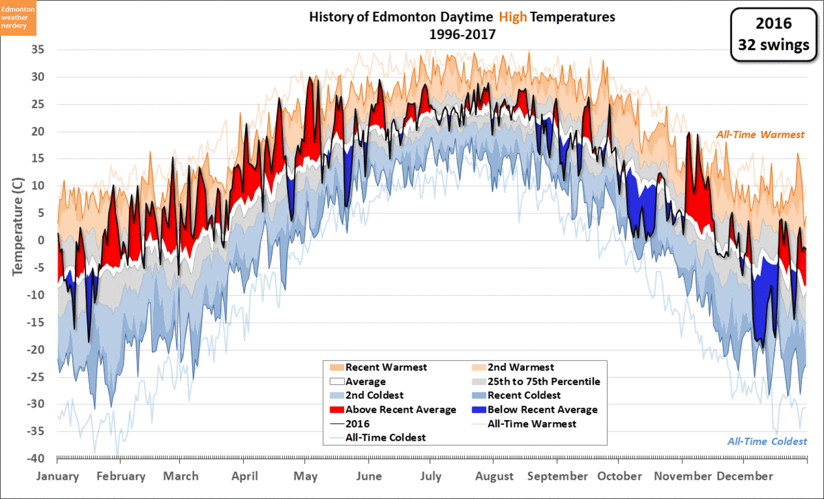
As a comparison, here we have 2016. The way that we're measuring things 2016 had a total of 32 swings, compared to 38 in 2017. But when we limit that to the changes of 15°C or more both years had 18. The largest changes for 2016 were a 23°C drop over a week at the end of April, followed by a 26°C warmup in early May.
The beginning of 2016 was the end of a large El Niño, and we can see that for February through late-April the temperatures were mostly well above the average, with only one large temperature swing during those three months.
2015

Here we have 2015. It had 38 swings in total, compared to 32 for 2016 and 38 for 2017. For 15°C swings it had 19, or one more than 2016 and 2017. The largest swings here were a 25°C drop over 4 days in January, and then a 26°C drop over 11 days in February.
The end of 2015 was part of the same El Niño that started 2016, and here again we can see that for October and November the temperatures were mostly above average. But then things did become erratic again briefly during December.
2010 to 2014

And finally, this chart cycles through the 15°C swings for 2010-2014. Here's the summary:
- 2010: 13 swings of 15°C or more. The largest were a 28°C warmup over 12 days in May, and a 27°C drop over 9 days in November
- 2011: 15 swings, including a 30°C warmup over 7 days in January, and a 31°C drop over 9 days in November
- 2012: 14 swings, including a 30°C 5-day drop in January, followed by a 31°C 5-day warmup.
- 2013: 19 swings, including a 26°C 6-day drop in January and a 31°C 6-day warmup in May
- 2014: 20 swings, including a 29°C 11-day warmup in January and a 32°C 9-day warmup in December.
Those are just a few examples, and all the years look pretty similar. With these charts it's tough to compare year-to-year though, or to get a sense of what's going on. That's what we're going to try to do next.
History

This chart takes the same approach to counting temperature swings, and it applies it to all of Environment Canada's data going back to 1881. In the earlier charts today we'd looked at all the temperature swings, and at the swings that were 15°C or more. This chart also adds counts for the 25°C and 30°C swings.
When we look at all of the temperature swings, we see that the 38 in 2017 was not unusual. Years like 2012 and 2014 were quite a bit higher with 46. And since the 1880s the 5-Year average has stayed fairly constant, ranging from the low-30's to the mid-40's.
When we move to the 15°C swings the 18 in 2017 were again very typical. Recently a year like 2010 only had 13 of them, but 2003 had 25. And again, the average has been around 18 since the 1880s.
2017 starts to look a bit unusual when we move to the 25°C and 30°C swings. 2017 had 7 swings of 25°C or more, including 2 of 30°C or more. Recently 2009 and 2011 both had about that many swings. To find a year which had significantly more we need to go all the way back to 1990, with 9 swings of 25°C or more, including 5 of 30°C or more. Going all the way back to the 1880s it looks like the number of large temperature swings has dropped a bit, although that's probably because we don't see High temperatures of -30°C or -40°C anymore.
So 2017 was not exceptionally erratic, but in terms of really large temperature swings it was a little bit on the high-side of what we would typically see.
1990

Here we have 1990, which is the only recent~ish year which had more large swings than 2017 did. 1990 had 41 swings total, 25 of 15°C or more, 9 of 25°C or more, and 5 of 30°C or more.
It looks a lot like all of the other charts from today, but there are a few really extreme months here. From mid-January through late-February there were a series of 30°C swings, and then in November and December the temperatures bounced around constantly.
Summary:
Today we've looked at how often Edmonton's temperature swings from above-average to below-average, or visa versa. This isn't just warm days or cold days, but is how often our weather switches between noticeably warm and noticeably cold.
This discussion was prompted by the question: "Was 2017's weather more erratic than normal?" That's a big question, and so to try to answer it I settled on the approach that we're using here - counting temperature swings between the 25th and 75th percentiles. That choice was arbitrary and it doesn't hold any deep meaning, but it did give us a consistent methodology to apply.
On average we saw that these temperature swings happen about 35 times per year, or about every week-and-a-half. That number varies from year-to-year, and during the summer the temperature swings are smaller than they are during the winter. But overall the numbers have stayed reasonably consistent over the last century, although the very largest swings have decreased a bit in the last few years.
The title today "If you don't like the weather, wait 5 minutes" is a quotation that's originally attributed to Mark Twain. He would have been referring to the weather in New England, but it's also a popular sentiment in Alberta. And it turns out that it's not entirely wrong, but rather than every 5 minutes it's more accurately about every 10 days.
No comments:
Post a Comment